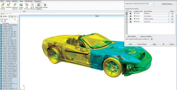
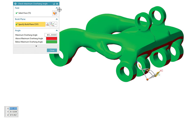
NX CAD model displaying overhang angles as color-coded regions, based on 3D printer build orientation (usually, the Z axis). The visualization identifies areas that may need support of post-print clean up. Image courtesy of Siemens PLM Software.


Latest News
December 1, 2016
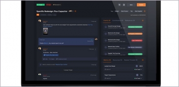
 PTC Creo View offers a way to display PLM data from Windchill as color-coded items. Image courtesy of PTC.
3D assembly models, authored in CAD programs and distributed in native or lightweight formats, account for a significant volume of the data that must be managed in engineering projects. The actual data management task, however, is usually relegated to the product lifecycle management (PLM) systems, designed to keep track of design variants, supplier data, compliance info, deadlines, schedules, costs and other pieces of information.
Many off-the-shelf PLM products have had facelifts with social media-inspired features (such as the incorporation of expandable and collapsible discussion threads), shape-based search functions and tighter integration with CAD. Nevertheless, at their core, most PLM systems still retain their origin as bill of materials (BOM) organizers, structured more or less like spreadsheets. They’re efficient if you need to examine project data in columns and rows with associated details, but they fall short in revealing certain insights that can only come from inspecting the assembly model itself.
Some have proposed visual data management, the use of the 3D assembly model as the gateway to PLM data. Instead of viewing project delays, cost overruns, and production issues as lists, bars, graphs and pie charts, you can see them as color-coded items on the assembly model itself. There’s good reason to believe this approach offers insights not possible with traditional PLM.
Visual Reports in NX and Teamcenter
About five or six years ago, Siemens PLM Software debuted what it called HD3D, a novel approach to data management. 3D CAD was historically a format to express geometry and shape, not project data. But under HD3D, Siemens PLM Software proposed projecting critical project data—such as part status, supplier info, cost overruns and compliance data—onto the 3D assembly model. In traditional data management, such data are displayed in spreadsheets, charts or graphs. With HD3D, a 3D model or a lightweight representation of the model can serve as the interface for data visualization.
“HD3D is a way to visualize your data without going through spreadsheets and Word documents,” says Paul Brown, senior marketing director at Siemens PLM Software. “You’ll find HD3D or visual reporting in both NX [the company’s CAD and simulation suite] and Teamcenter [the company’s PLM software]. You can color-code an assembly using specific criteria, such as materials used, release status or suppliers. The idea is to let you navigate your data using the 3D model. When you find the item you’re interested in, you can drill down deeper.”
With visual reporting, you can infer certain issues with the project if the cost overruns, schedule delays and noncompliant parts are confined to components related a specific region of the assembly. You may also come to recognize the correlations between compliance issues and cost overruns in a way you cannot hope to in a list view.
 NX CAD model displaying overhang angles as color-coded regions, based on 3D printer build orientation (usually, the Z axis). The visualization identifies areas that may need support of post-print clean up. Image courtesy of Siemens PLM Software.
“We deployed visual reporting in NX and Teamcenter for two different types of users,” Brown says. “Engineers who need to do the heavy lifting to understand the context may look at the information in NX. They need to perform an extended amount of checks and verifications at the design level. But managers looking for summaries and rollups don’t want to go into NX to do that, so we give them a way to visualize it in Teamcenter, not in a full-blown CAD system like NX.”
In Teamcenter, you can use the integrated lightweight viewer powered by the JT format to initiate visual reports. Siemens describes JT as “the first ISO International Standard (IS 14306-1) for 3D visualization and collaboration. Compact and accurate, JT is used throughout the product development lifecycle in all major industries to communicate the critical design information typically locked up inside a CAD file.”
HD3D was such a novel approach to data management that people were initially reluctant to embrace it, Brown recalls. “Among CAD users, we faced quite a challenge,” he says. “They can understand a new blend tool or geometry editing function, but when we first introduced visual reporting, many of them said: ‘That’s good for my manager, but not for me.’ It took some time to show them how to interrogate the data [in visual reports]. Then they realized: ‘Oh, this can make my life easier.’ We also had to work with them to better understand the type of visualization they wanted to do.”
Visual reports are made possible by a software architecture that allows color-coding in 3D and tagging. Therefore, you may employ the same approach beyond CAD and PLM, Brown points out.
New Suite for Additive Manufacturing
The same tagging and color-coding system is expected to be in Siemens PLM’s upcoming software suite for additive manufacturing (AM), set to debut in early 2017. “If you have a void in your part, it tends to trap powder in an AM process. So you’ll need to be aware of those areas,” explains Brown. “Then you might consider putting a hole in that area to vacuum or wash out the residue powder. You might also want to check overhangs that typically need support structures during the build process. We’re using the same tagging and color-coding scheme to create out-of-the-box visual reports for these types of situations.”
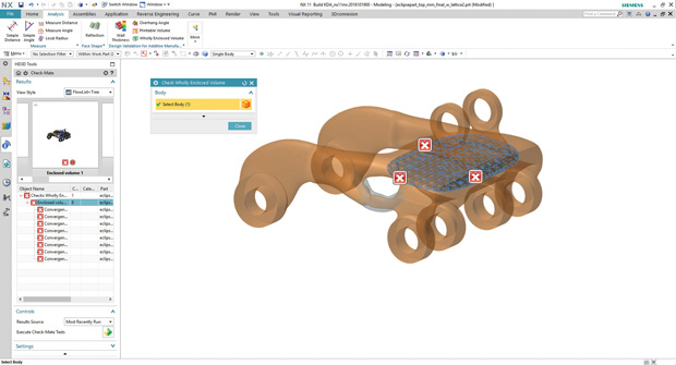 NX with enclosed volumes tagged and displayed, identifying areas where powder could be trapped in additive manufacturing. Image courtesy of Siemens PLM Software.
Over time, AM or 3D printing has evolved from a prototyping technology to a viable manufacturing process. Along with Siemens PLM, Autodesk and other CAD vendors are looking for ways to bolster their AM design and simulation tools. (For more, read “The Race is On to Fill the AM Gap”)
Color-Coded Creo Views
In the last decade, PTC re-engineered itself from a CAD and PLM company to an IoT-centric product development company. In PTC Creo View, a lightweight 3D data viewing application, data visualization can be executed as color-coded 3D models powered by PLM data.
To make color-coded data visualization possible, PTC Creo View harnesses the relevant project and product data housed in PTC’s PLM program Windchill. “The queries are executed dynamically; therefore, they reflect the current status (rather than a canned view),” says Mark Lobo, senior director of Solution Management, PLM Solutions at PTC.
PTC’s PLM software is used by many businesses, including those that do not use the company’s CAD program PTC Creo. Therefore, some customers may need to use the same color-coding feature in a mixed-software setup.
“Because Creo View is tightly integrated with Windchill, the PLM data is seamlessly and dynamically made available to the Creo View session as attributes that can be used for search/filters/display,” explains Lobo. “[For those who use a different CAD platform other than PTC’s,] PTC does provide adapters to convert CAD data from most MCAD and ECAD applications to the Creo View file format. In addition, PTC also provides toolkits (Java, Office, Web/JavaScript) for Creo View to enable custom visual applications to be developed ... you can use these toolkits, along with the adapters, to generate Creo View-compatible files to use with third-party PLM, MRP and ERP systems.”
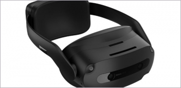
Data Visualization in AR/VR
In November 2015, PTC acquired Vuforia from telecom giant Qualcomm. The deal makes Vuforia’s augmented reality (AR) and virtual reality (VR) product lines part of the PTC portfolio. It opens doors to data visualization in AR/VR gadgets. “Vuforia Studio leverages Creo View data for generating AR/VR experiences,” says Lobo. “The flexible nature of the Creo View format allows conversion from most 3D formats and enables optimization/reduction of the data according to purpose, including the delivery for mobile devices and head mounted displays (HMDs).”
Sharing 3D data in collaborative product development has always been a difficult balancing act. In IP-sensitive industries like automotive and aerospace, project leads must weigh the need to share product data with outsiders (contractors and suppliers) against the risks of IP theft. Sharing a 3D CAD file carries the highest risk, as the rich geometric data can be used to reverse-engineer the product. Sharing the same product in a lightweight 3D format reduces the risk, as the low-fidelity geometry prevents replication of the product with full details on the shop floor. Here, the AR/VR-powered collaborative approach offers another safety mechanism.
“With AR/VR gadgets, no IP in the form of CAD data (native or lightweight) needs to be shared,” points out Lobo. “In addition, products can be experienced at real-world scale (1:1) in the environment where it might be used. This can be done without a need for a physical prototype.” That’s because AR/VR gadgets usually use pixel- or polygon-constructed data that carries little or no risk for reverse engineering.
A Natural Interface
Different versions of visual reporting or assembly color coding are available in many PLM products. Autodesk, for instance, offers data mapping that lets you display data housed in Autodesk Vault (the company’s workgroup level engineering data management product) on 3D assemblies in Autodesk Inventor (the company’s primary mechanical CAD product).
Siemens’ Brown noted, “This is a much more natural way to navigate through information. We’re get positive feedback on how natural it is.”
Most mainstream PLM vendors now offer mobile apps as a way to accommodate the road warriors who need to review, annotate, approve and comment on design files. But visual reporting (as Siemens PLM calls it), data mapping (as Autodesk calls it), or color-coded models (as PTC calls it) is only available in a small number of mobile apps.
Facilitating visual data management as a mobile feature makes sense, because color-coded models offer a quick view of the most pressing issues that may not be self-evident in color-coded lists and columns.
Some vendors consider the feature mobile-accessible because it can be accessed from a web browser from a mobile device. However, without fully integrating it into a mobile app, the feature doesn’t offer its full potential, as smaller devices aren’t ideal for displaying and navigating 3D assembly models.
More Info:
Subscribe to our FREE magazine, FREE email newsletters or both!
Latest News
About the Author
Kenneth Wong is Digital Engineering’s resident blogger and senior editor. Email him at [email protected] or share your thoughts on this article at digitaleng.news/facebook.
Follow DE